Delivering justice.
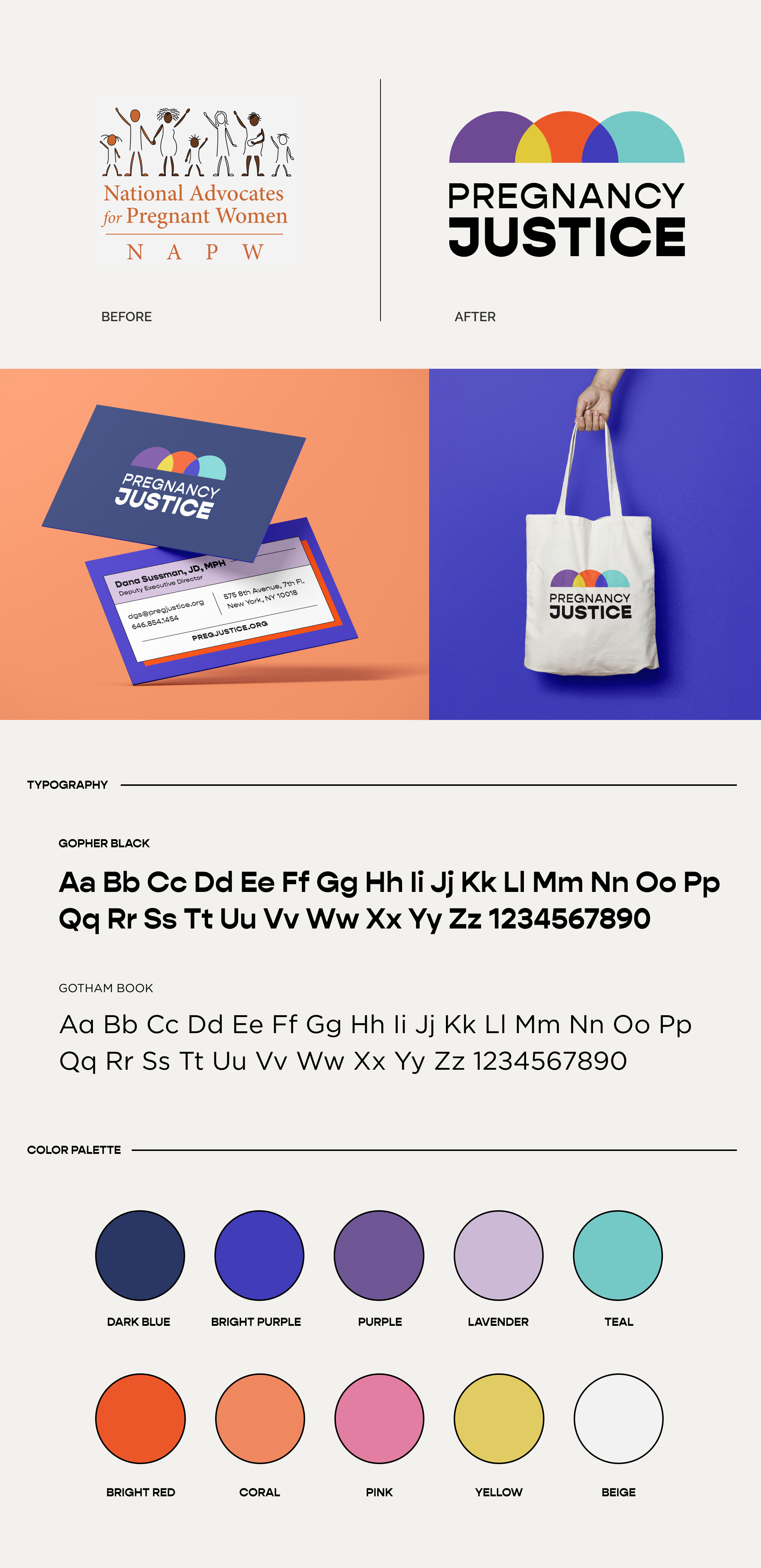
When we first connected, this organization went by the name of National Advocates for Pregnant Women (NAPW). It had been 20 years since the organization’s inception, but NAPW’s mission remained the same: fighting to protect pregnant women’s legal rights by defending those who’ve been criminalized. But in those 20 years, the organization had outgrown its name. Today, their focus on “pregnant women” represented an outdated mindset. NAPW was eager to reintroduce themselves with a more inclusive brand that did justice to their work and engaged new audiences.
We began with their name. After a range of stakeholder interviews and internal brainstorms, we presented thoughtful, memorable names that embodied the power of the organization’s work. Through a collaborative effort, we began honing in on names that said more with less – names that weren’t afraid to speak their truth. Ultimately, we were thrilled to land on Pregnancy Justice.
The logo process was filled with creative exploration. We walked the Pregnancy Justice team through detailed logo presentations, demonstrating how each concept can look in different orientations and applications. As we progressed through the process, it became clear that the more vibrant, energetic options were rising to the top. The selected logo concept used shapes and colors to reference pregnancy, community and diversity – three pillars of Pregnancy Justice’s work.
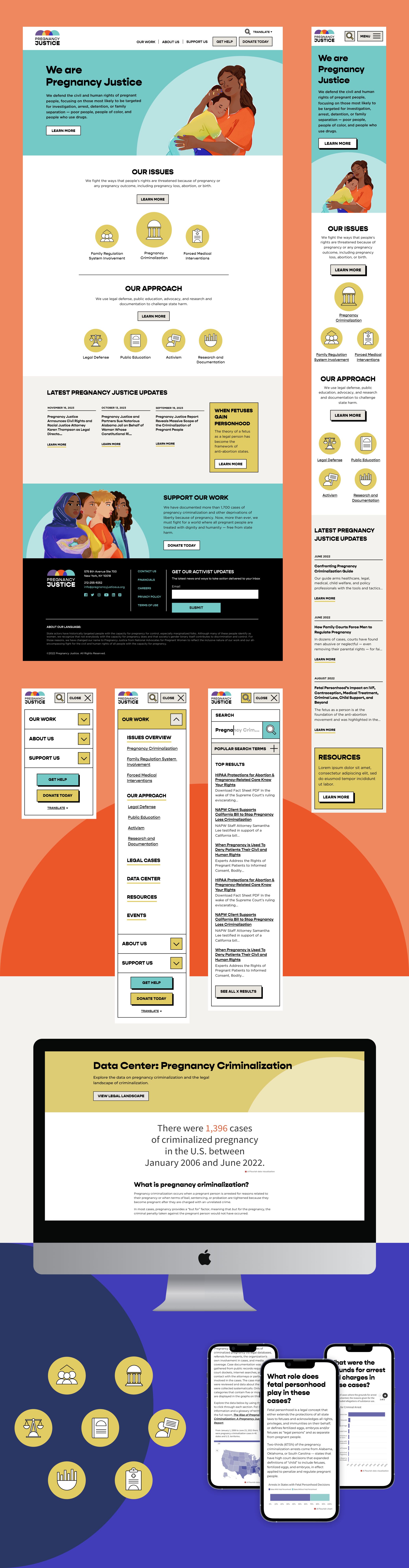
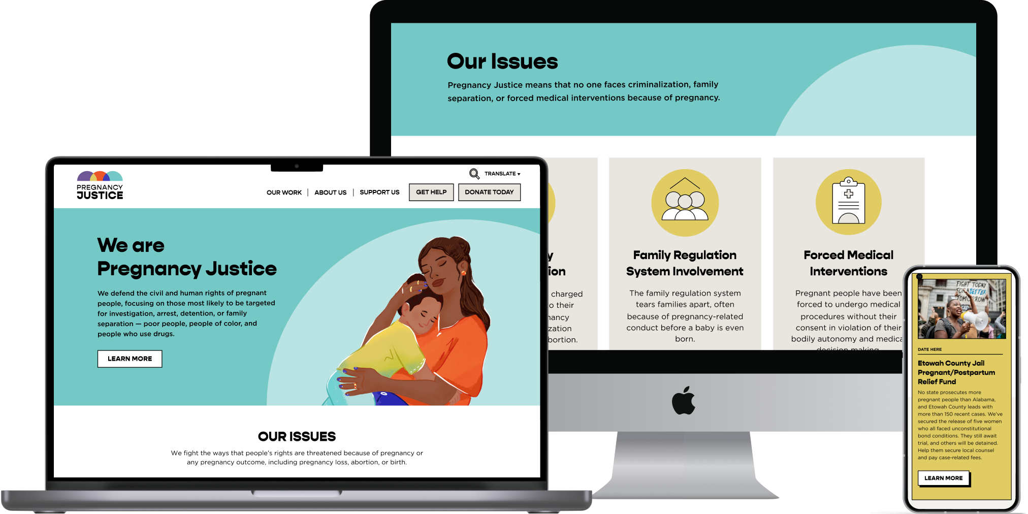
With the name and logo in check, it was time to rethink Pregnancy Justice’s website. Leaning on our research findings, we recommended a web framework that emphasized clarity over content, carving out pages for the issues they face and the approaches they put forth. We also brought a heightened sense of user experience and hierarchy to key pages, such as sections for their resources and news.
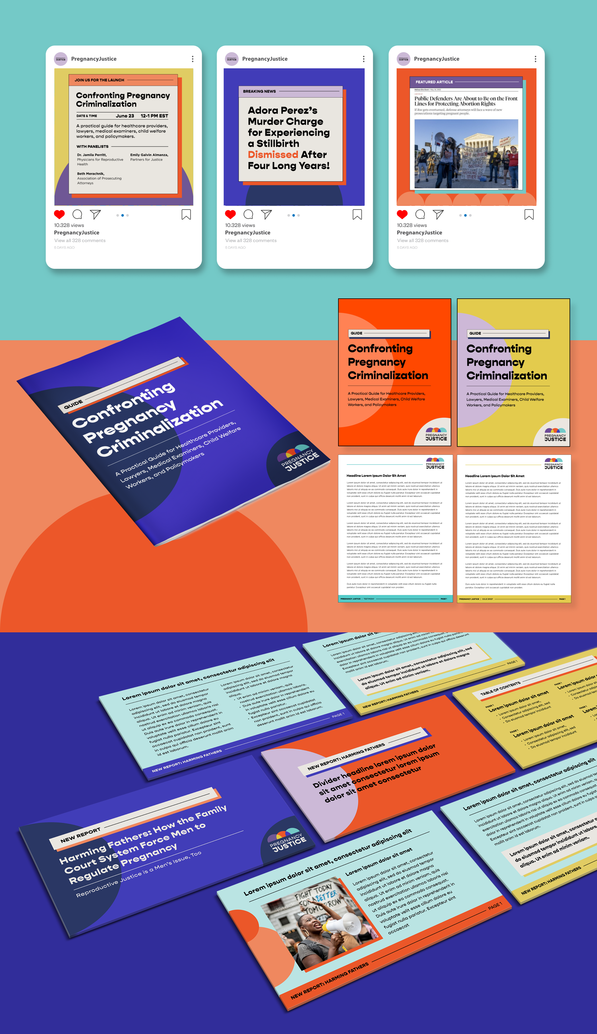
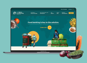
Design-wise, the system grew organically from the new logo. Vibrant colors permeated every page and semi-circles drew attention to key content. Privacy concerns made it challenging to feature those who Pregnancy Justice serves, so our teams worked closely together to select an illustrator whose work meshed with the new brand and connected to their work. These beautiful illustrations brought a more personal touch to the website.
One of the website’s focal points is the Data Center. Working alongside Strength in Numbers, we built a section where startling data points are brought to life through interactive, branded data visualizations. Like the rest of Pregnancy Justice’s new website, these data visualizations can be easily updated by any member of their team.
The new Pregnancy Justice website is a major shift from where they were. This website is flexible, accessible and adaptable, representing the Pregnancy Justice of today while allowing room for future evolution.