A stronger foundation for mental health awareness.
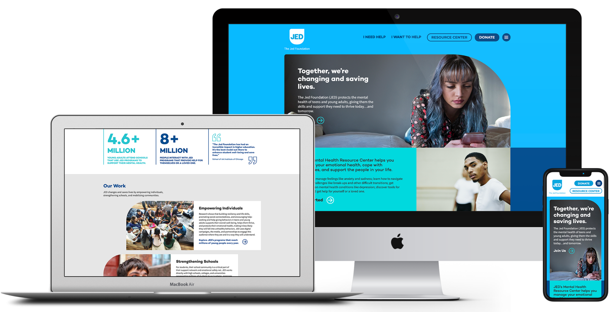
The Jed Foundation (JED) protects emotional health and prevents suicide for teens and young adults. Over the years, the organization had amassed a collection of six websites that covered their core content, campaigns and programs. JED hired us to carefully consider the effectiveness of each site and determine the best path forward.
First, it was time to perform some research. Working alongside information architecture consultancy Logic Department and social impact agency Whole Whale, we facilitated user interviews, conducted user testing, inspected Google Analytics and analyzed SEO. Our findings allowed us to quantitatively and qualitatively assess each site’s significance regarding purpose, popularity, content and overall impact.
Ultimately, we discovered that JED would be best positioned for success with a single, all-encompassing website focused on mental health resources and JED’s programming. Thankfully, our friends from JED were on board with this major shift.
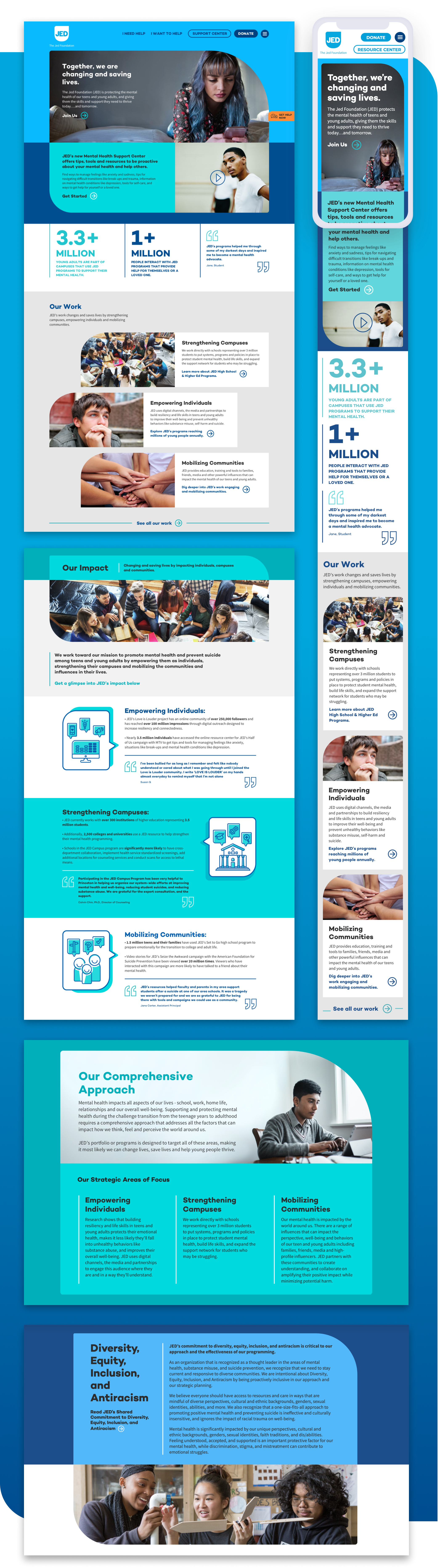
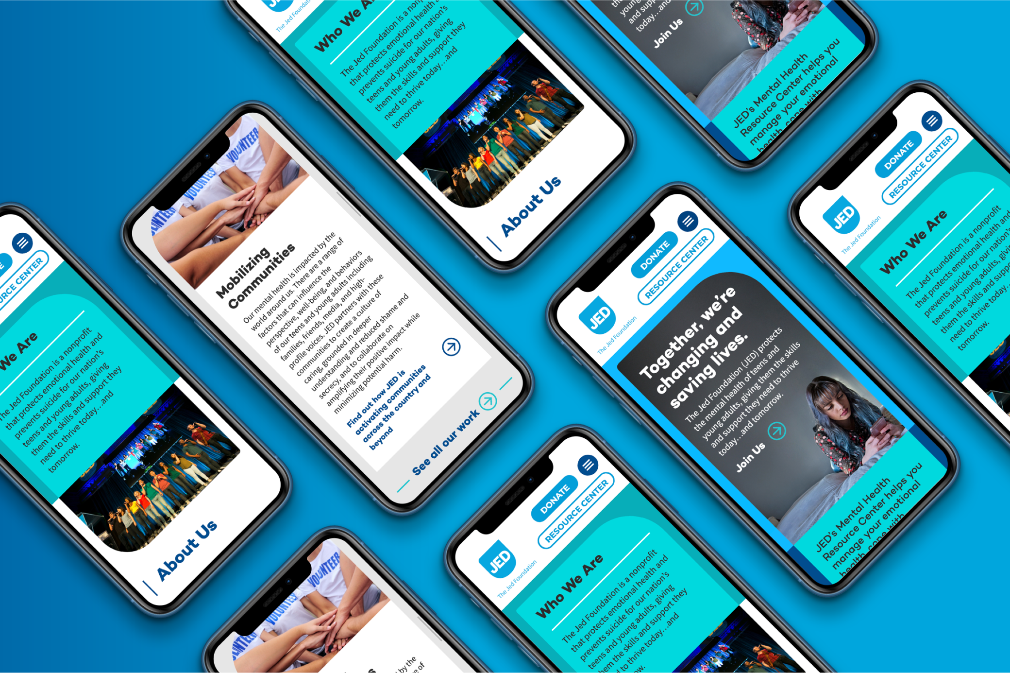
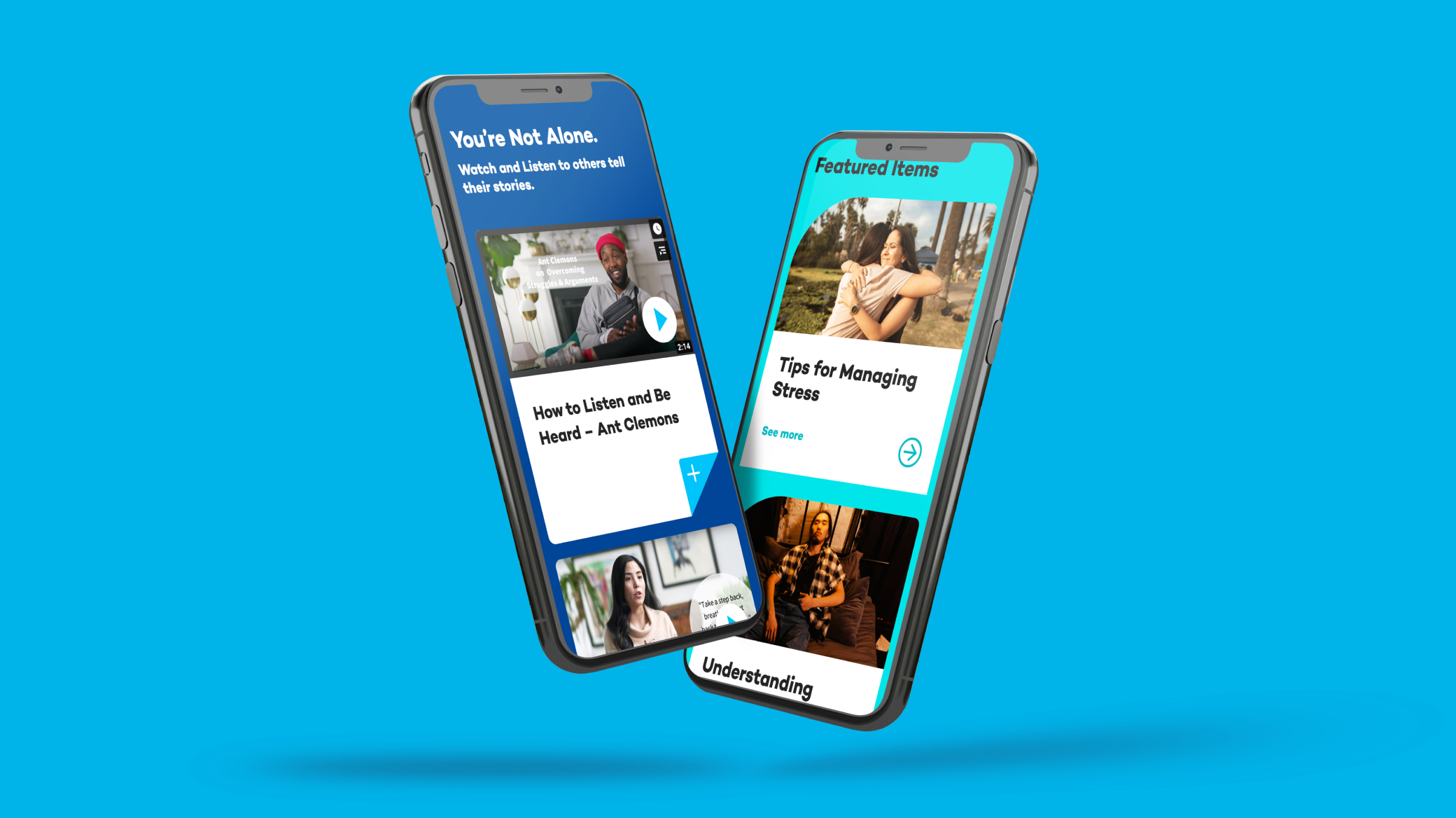
While JED’s previous website featured content focused on the organization, our research showed the new website would have a greater impact by emphasizing JED’s mental health resources. For starters, we developed a navigation that broke visitors into two core categories: those who need help and those who want to help others. Next, we worked closely with a team of writers to rethink the resource categories and draft new language that was timely, accurate and meaningful. To make sure the website consolidation process left no stone unturned, we led a wide-ranging content mapping process. This allowed us to identify which content from the six websites would be featured on the new one, and where that content would live.
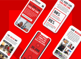
With the foundation of the new website in place, we created a design system that drew inspiration from the shield in JED’s logo. We used this rounded shape as a window to house content and photography, bringing a sense of calm and structure to this important subject matter. We also constructed a playful icon system that melded the shield aesthetic with the organization’s youthful yet professional vibe.
Given the extensive amount of content that would be folded into the new website, we built a WordPress back-end with an array of flexible content blocks. This approach empowered back-end users to build pages of all shapes and sizes while still upholding the integrity of our design system. During the development process, we also built a user-friendly form flow where the JED team can easily create new forms that support their programming. And given the website’s depth and breadth of content, we built out a search tool with predictive technology, popular searches, and a results page with clear categories.