6 website designs to inspire you for 2023
An engaging website with thoughtful design invites people to learn about your organization, builds credibility, and attracts donors. However, much like swiping through a dating app, studies show that users decide whether they find websites visually appealing in fractions of a second. A big part of getting users to stay on your website and actually explore is to capture their attention with an immersive, well-crafted design that makes a good first impression.
So, what makes users want to find out more? Let’s roll through the ones we’ve swiped right on!
[Disclaimer: as proud as we are of the websites we’ve designed, we’ve focused our attention here on other websites.]
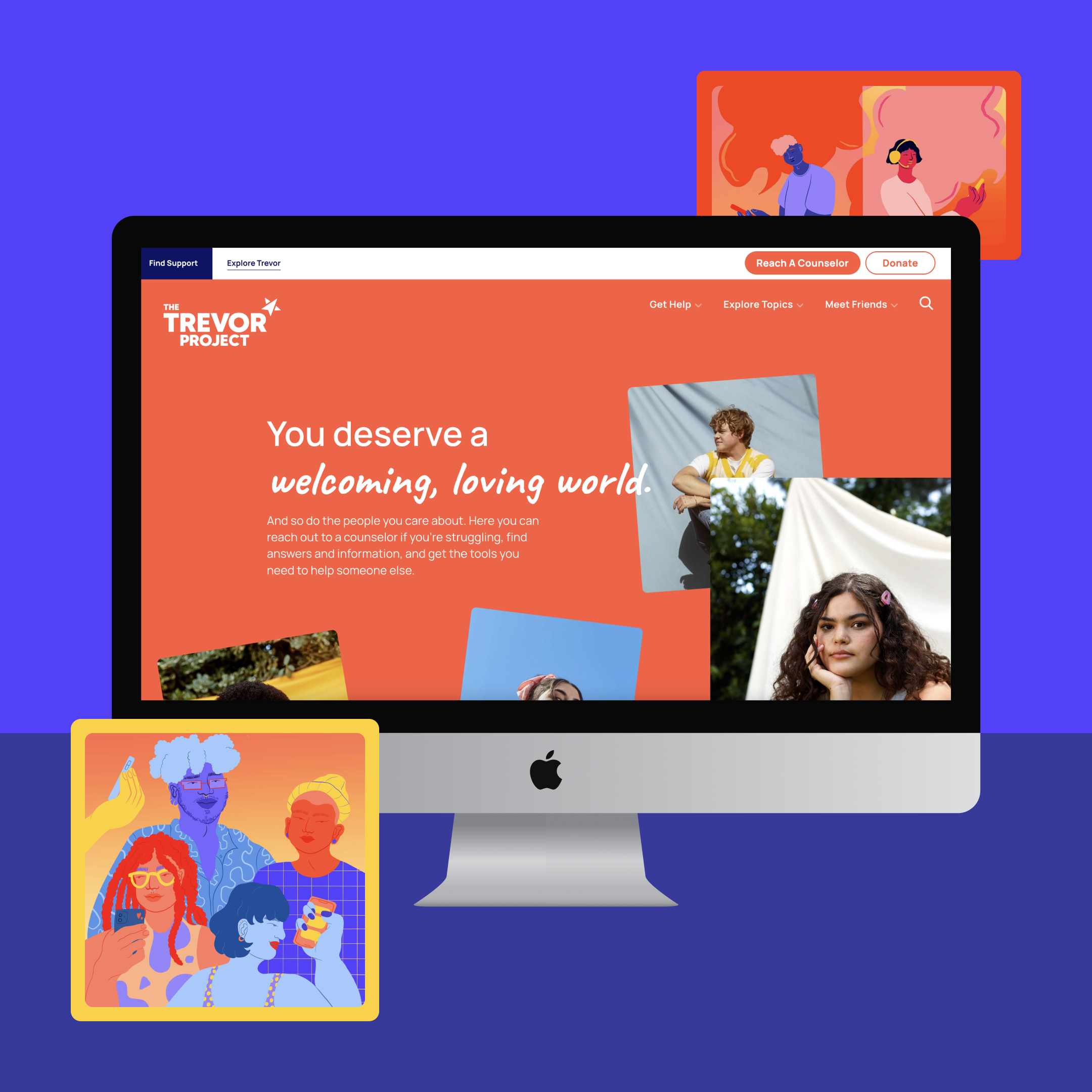
The Trevor Project
Why we like it: Color and simplicity
The bold color palette on this site strikes you from the beginning and is carried throughout (including some very cool illustrations 🎨). The colors really get to shine here without being too busy because of how well The Trevor Project organizes their information. The site is super simple to navigate, highlighted by a resource center that’s full of materials but easy to digest.
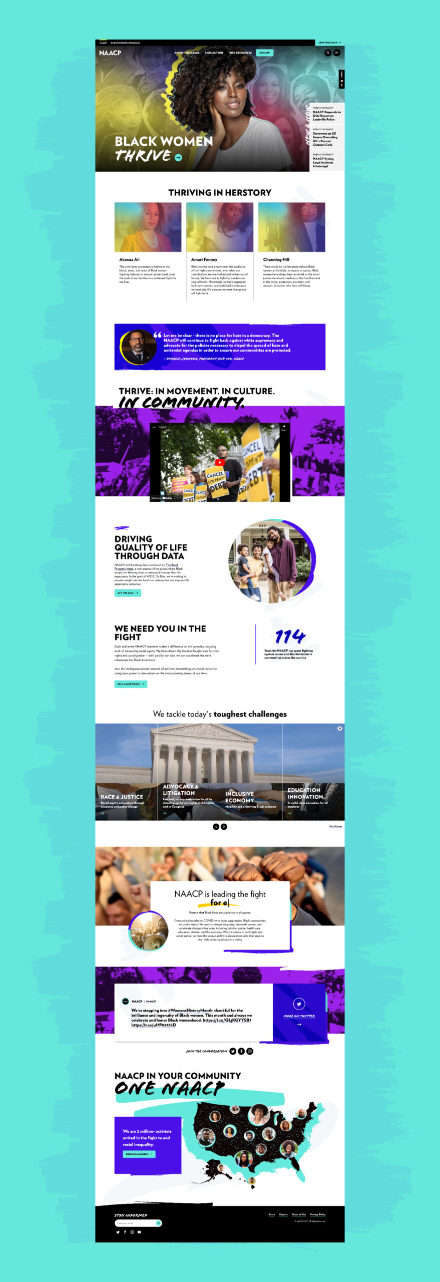
NAACP
Why we like it: Boldness and edge
The colors all across the site are vibrant and strong. This bold vibe carries into the fonts used in headlines and photo treatments, encouraging you to continue your journey. All in all, the site buzzes with a sense of excitement and an in-your-face, won’t-back-down spirit one might feel at a march or a protest. We’re ready to start making signs and calling Senators 🗣️🪧!
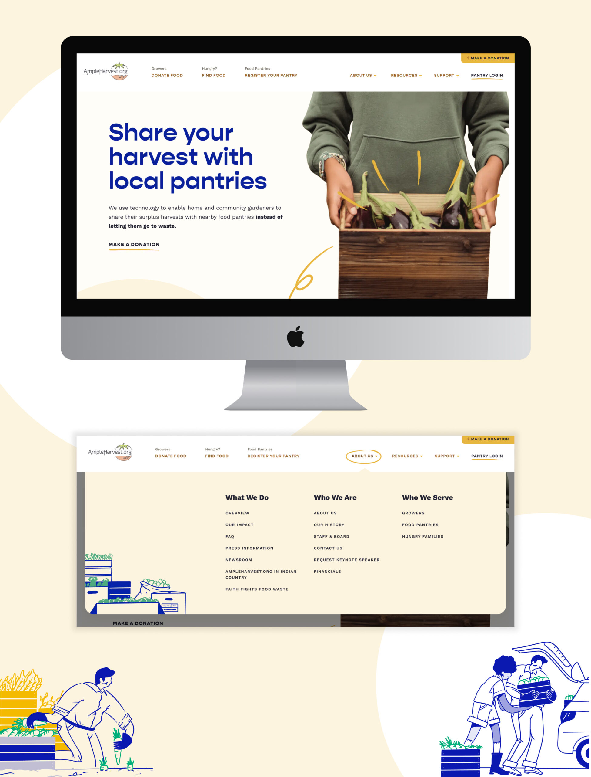
Ample Harvest
Why we like it: Illustrations and drop-downs
The illustrations inject fun flare and personality throughout the site. We also love that the drop-downs for About Us, Resources and Support have their own look. Plus, the whole site’s design is clean and simple, which keeps the focus on their solutions to diminish hunger.
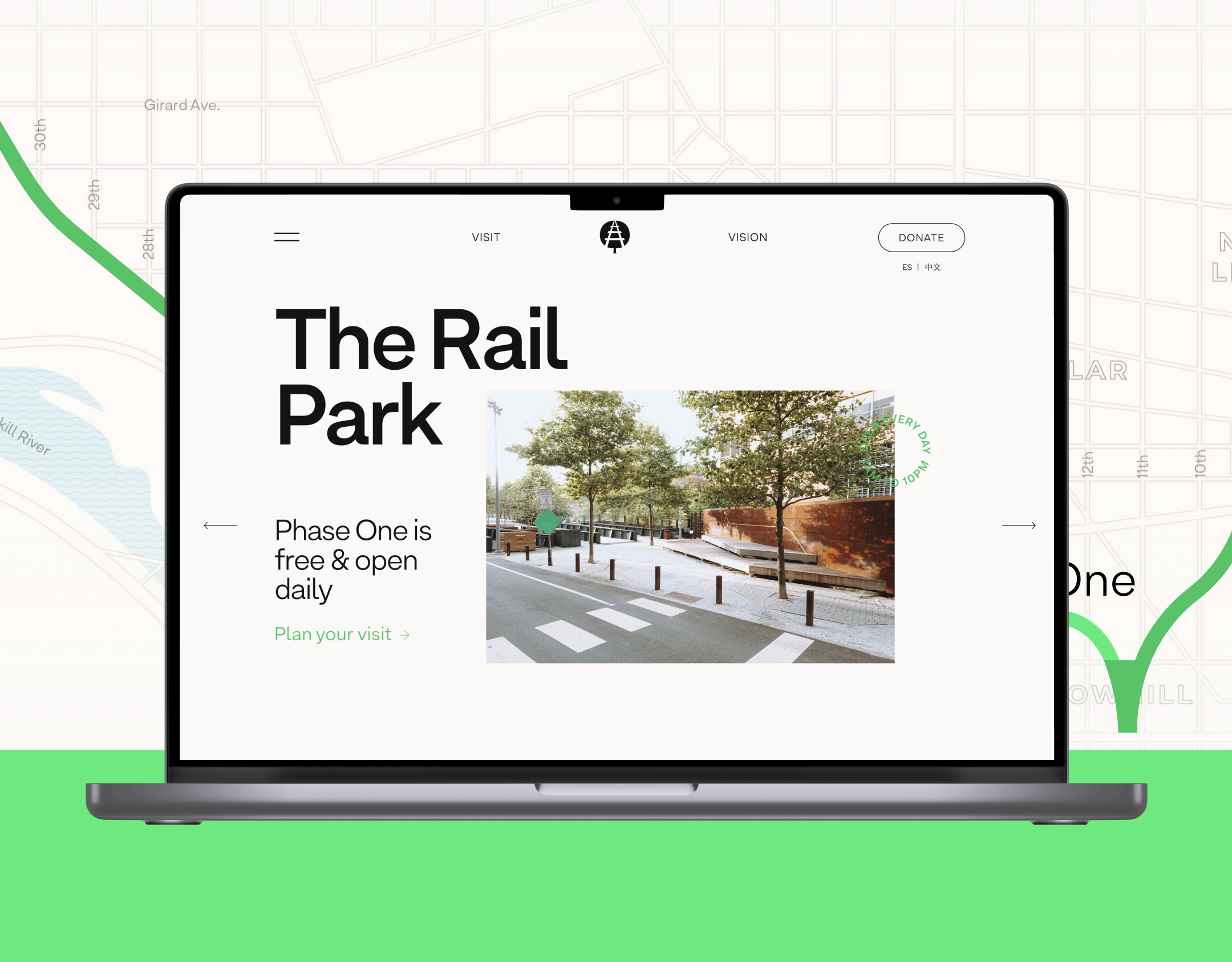
The Rail Park
Why we like it: Surprising and interactive
At first glance, this site seems fairly straightforward. But as soon as you begin to interact, you quickly notice it’s full of engaging elements. There’s the main menu unfurling to reveal an interactive experience, cool hover states like on the Team page, and clever scrolling animations on the Vision page. Once you see what happens on one page, you can’t help but wonder what the next will reveal. Take some time to explore!
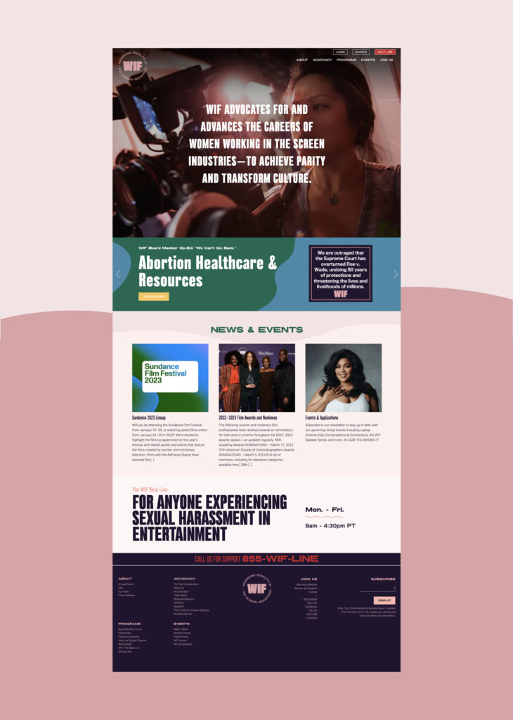
Women In Film
Why we like it: Clarity and energy
You don’t have to go digging for their mission. The bold font and big callouts make key info hard to miss, like their hotline at the bottom of the home page (which can be a tricky spot to put information). The wave patterns and subtle use of animation give the whole thing a nice sense of movement and energy. Overall, the colors and branding on the site feel very them – and having a website that matches your organization’s vibe is always a win.
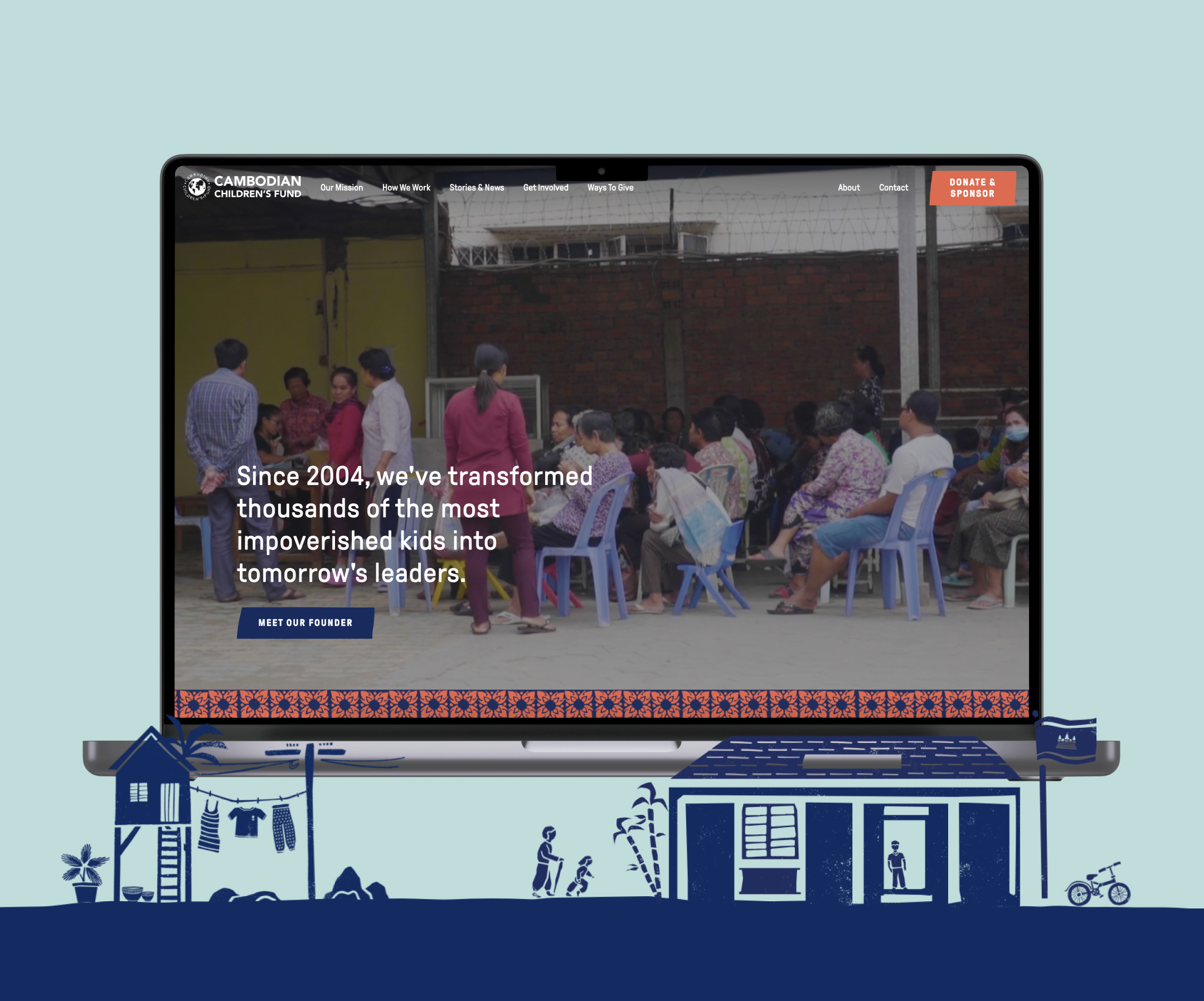
Cambodian Children’s Fund
Why we like it: Patterns and textures
This site uses a lot of photography, icons, patterns, textures and colors – but it all comes together beautifully. The understated typography for headlines and calls-to-action paired with the other design elements creates a nice balance of seriousness and a playfulness. All in, this execution of branding feels like a perfect fit for this organization and what they’re trying to communicate.
